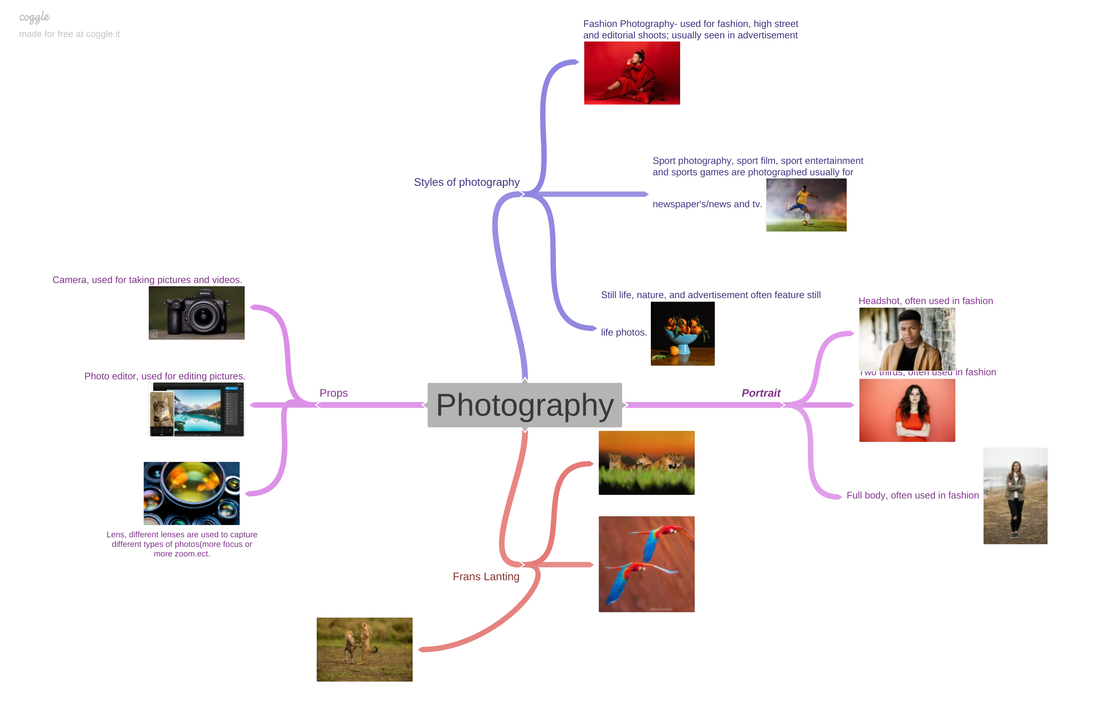
My portrait portfolio-
Statement of intent-
I have a total of two terms in my school year to complete this entire project, including Research, Exploring, Photographing, Editing, Final Outcomes and an Evaluation.
The theme of work I intend to produce for my portfolio will be an incredibly detailed and interesting project which will contain various pictures, videos and edits displaying portraits of models modelling amongst the history of Manchester and the interesting wastelands which I have encountered within it. I aim to explore the feeling and emotion behind being alone and the fascinating sensation which is felt with the absence of life within these wastelands, I aim to capture this using the models emotion and the location in which the model is ; it also interests me (and hopefully the viewer)that such desolate spaces can be contained within the fast growing, electronic metropolis of Manchester, such an urban place - maybe venturing into even more colossal cities such as London to explore its wastelands and capture majestic portraits as well. I hope that by year 11 I will have built up an interesting, large, relevant and fascinating portfolio to submit to the teachers. By then I hope that I have explored many different aspects of these fascinating wastelands and how they came to be, I also hope to explore emotion through location and modelling. I will explore many different techniques when capturing these pieces of work, I will then be able to link it to a famous photographer who has captured similar work to my own.
Once I have collected the necessary amount of work needed, taking the forms of photographs and videos I will be able to connect it back to the theme, to a known photographer/videographer that has captured a similar theme and finally the project which I set out to achieve. An example of a photographer whose work I can use to inspire my own due to the similarity is ‘NICK BRANDT’ who captures pictures of the bad side of the ever growing cities and how natural, un-urbanized spaces are becoming more uncommon and how we, as a community, need to do something to stop this. Nick uses incredible techniques to achieve this, outstanding editing and wonderful choice of dull colors; I aspire for my pictures and videos to achieve the same affect and to portray a very similar story through the art of portrait. I will first study the works of 'NICK BRANDT' and take inspiration from his work.
At first I planned just to capture the landscape of these wastelands, but after a more in depth look at it, I realized that I can incorporate portraits with previously learnt techniques to create even more powerful work. For example I can create a contrast between a city landscape and a more deserted landscape that makes it stand out more and delivers the message I am trying to put across. I could use a model and make their emotion hold the same depressing feeling as the landscape they are in. I could also capture life or a model to express the emotion of the piece. I could also use techniques such as central focal point or the rule of thirds to create a more interesting piece of work.
After I have captured the pieces of work and before I add them to my portfolio I would like to further enhance these pieces by using different photo/video-editing software and techniques to fully express these pieces of work. On Photoshop I can use techniques such as layering, cutting and enhancing pictures. On a video editing software I would be able to trim, enhance and add suitable music to fully bring these pieces of work to life. This will also help me expand on my knowledge for upcoming exams, therefore helping me achieve higher grades overall. Moving on from my previous project of ‘Portrait’ I aim to show a lot more techniques and professionalism in my work, overall having a more confident approach to my work.
Due to my upcoming exams I will start revising more and completing projects from home as well as in school to an impeccable standard, aiming to achieve the highest grades I possibly can. At home I aim to capture work, edit work and revise for upcoming exams. I will be able to build on this work from school as well.
By the end of this project I will write up an evaluation to sum up all of my work this year. I will also improve by working on my ebi’s and transforming them into my strengths by the end of the year. In the reflection I will look at what I did well and what I need to improve on in this project, making my next project even better.
Initial ideas:
Mood boards

|

|

In depth analysis-
Context
What's the context of the picture?
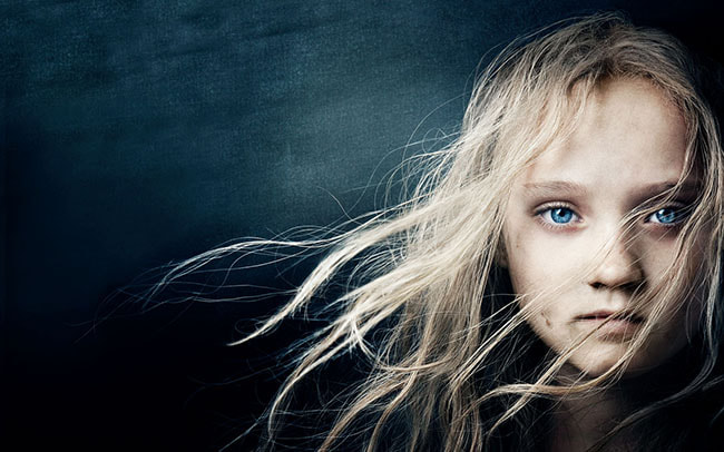
Annie Leibovitz took this photo in 2012 as part of the promotion of the film 'Les Misérables'. Annie Leibovitz is a 73 year old American photographer best known for her engaging portraits which often feature subjects in intimate settings and poses. In this famous photo she manages to superbly capture an interesting picture of a young girl that seems to hold more meaning than what's visible to the eye. She captures the blank face of a small girl cleverly and manages to create what seems to be an entire story through just a single picture. The film 'Les Misérables' is originally a tragedy novel explaining why the photographer has chosen to capture this picture of an emotionless young girl, which helps portray the sad, distraught storyline subconsciously preparing the viewer for the film. The character in the cover is Corset, who is played by Isabelle, the forlorn daughter of Fantine, who is a servant in the film/play explaining her scruffy and rough look in the picture. To achieve this effect she has purposefully used dark lighting and a fast shutter speed to achieve the crystal clear image, also using the rule of thirds to create an even better image. Using the rule of thirds lets the image contain double the amount of empty space than the subject, this creates a feeling that she is lost and is confused. The fast shutter speed makes the dirt and rough expression on her face look more clear to the viewer. The shutter speed also makes the image darker; this creates more suspense and gloom.
Content
How did she use the content of the picture to achieve this?
In this portrait, by putting emphasis on the small girls face and enhancing her deep, beautiful blue eyes while still upholding her straight, emotionless face, Anne creates a mood, puts across a message to the viewer that the girl has been through a lot, this opens the opportunity for interpretation to the viewer when imagining what the girl has been through. The pale, blonde girl is brought alive, popped out over the gloomy, melancholy background, her bright blue eyes stand out over her pale face bringing the viewer's attention right to it, making the viewer feel as though they are always being watched. She has purposefully made the eyes stand out to bring the viewers attention to it, the eyes are a majestic, bright, beautiful shade of blue, the background is also blue, but a lot more dull, this makes the eyes stand out over the background and also make her face pop . They have also purposely made her hair dirty and placed dirt on her face creating a message to the viewer and letting the viewer imagine what she has been through and how rough it must have been. The background has also been distorted making her face pop out even more, the picture has quite a dark gloomy theme. It feels as though it is trying to communicate a sad, melancholy message to the viewer. As they are portraying a servant they have purposefully and successfully made her look rough and depressed using emotion. They have also linked her rough clothing to the poor, present, slave community of the era making the viewer feel sorry for her before they have even watched the film, this can make them more eager to watch it, which is a good marketing technique that intrigues more viewers. They have also placed dirt on her face to make her look even more rough and make the viewer feel even more empathy to see this suffering young girl. The picture contains a rough texture on both the small girl's innocent face and the rough plain background, adding visual interest, highlighting unique patterns or even evoking emotions. A dark gloomy lighting has been used limiting the colour in the picture and making it in-vibrant and colourless, this makes her bright blue eyes stand out over the dark, dull background, lighting determines not only brightness and darkness, but also tone, mood, and atmosphere, helping the viewer imagine what she has been through. The lighting at the back, as mentioned previously, has much less light then the face and the eyes, making the eyes pop out.
Composition
How did Annie Leibovitz use composition to make the picture stand out even more?
Leibovitz uses composition to further enhance the picture and make it even better. She manages to further improve the picture as she uses the rule of thirds, cleverly splitting the image into 3 parts and intelligently placing the girl on the far right side - this creates a feeling of being alone, which links to the poor, slave status of the girl. She also uses depth of field to make the young girl stand out over the meaningless, out of focus background, this creates a background and a foreground separating the different key features of the two, and uses the wavy hair to create strong leading lines, making the viewers eyes follow the strands of hair over the girls face and into the dark obis that is the background and set it out in a way that draws the viewer's eyes towards the the young girls rough face. The photographer has obviously used a tripod, I can tell as the picture's frame is perfectly balanced. Leibovitz might have used ISO 800 on this picture to create the gloomy yet bright mood, she also might have used the Tungsten white balance, making the white, pale shade of her skin and the pale, yellow locks of hair, flowing over her face, stand out and be extra bright and white over the dull background . I think Leibovitz might have used an aperture of 8 as the image has the girl's face in focus while the background is out of focus, drawing the attention of the spectator to be drawn to the emotion in her face and the features that stand out, especially her eyes. Finally to finish off the composition, I think Leibovitz might have used a shutter speed of 1/1000 as the picture is perfectly in focus and paused on the girls face, expertly capturing the flowing hair in motion, they might have also used a fan to create this effect.
Connect
How can I connect this picture to my work (what do I like and dislike about the picture)?
I really like this picture as I think Leibovitz has superbly used content, context and composition to superbly create fabulous pictures that holds so much meaning and looks really good, I link this to my work as I like creating pictures that hold lots of meaning-to tell a story-and I also like using a fast shutter speeds to truly capture the moment, she also uses technique's I like rule of thirds, as stated previously. I like her portrait as it is used to represent the poor slave community at the time creating sympathy for them and especially this young girl superbly setting the viewer up and preparing them to enjoy the movie. If I was to recreate this picture ,instead of putting the girl in front of a plain, greyish blue background, I would choose a dull, yet beautiful, colourless yet spectacular backdrop making the young girl stand out still, but giving extra detail in the backdrop.
What's the context of the picture?
Annie Leibovitz took this photo in 2012 as part of the promotion of the film 'Les Misérables'. Annie Leibovitz is a 73 year old American photographer best known for her engaging portraits which often feature subjects in intimate settings and poses. In this famous photo she manages to superbly capture an interesting picture of a young girl that seems to hold more meaning than what's visible to the eye. She captures the blank face of a small girl cleverly and manages to create what seems to be an entire story through just a single picture. The film 'Les Misérables' is originally a tragedy novel explaining why the photographer has chosen to capture this picture of an emotionless young girl, which helps portray the sad, distraught storyline subconsciously preparing the viewer for the film. The character in the cover is Corset, who is played by Isabelle, the forlorn daughter of Fantine, who is a servant in the film/play explaining her scruffy and rough look in the picture. To achieve this effect she has purposefully used dark lighting and a fast shutter speed to achieve the crystal clear image, also using the rule of thirds to create an even better image. Using the rule of thirds lets the image contain double the amount of empty space than the subject, this creates a feeling that she is lost and is confused. The fast shutter speed makes the dirt and rough expression on her face look more clear to the viewer. The shutter speed also makes the image darker; this creates more suspense and gloom.
Content
How did she use the content of the picture to achieve this?
In this portrait, by putting emphasis on the small girls face and enhancing her deep, beautiful blue eyes while still upholding her straight, emotionless face, Anne creates a mood, puts across a message to the viewer that the girl has been through a lot, this opens the opportunity for interpretation to the viewer when imagining what the girl has been through. The pale, blonde girl is brought alive, popped out over the gloomy, melancholy background, her bright blue eyes stand out over her pale face bringing the viewer's attention right to it, making the viewer feel as though they are always being watched. She has purposefully made the eyes stand out to bring the viewers attention to it, the eyes are a majestic, bright, beautiful shade of blue, the background is also blue, but a lot more dull, this makes the eyes stand out over the background and also make her face pop . They have also purposely made her hair dirty and placed dirt on her face creating a message to the viewer and letting the viewer imagine what she has been through and how rough it must have been. The background has also been distorted making her face pop out even more, the picture has quite a dark gloomy theme. It feels as though it is trying to communicate a sad, melancholy message to the viewer. As they are portraying a servant they have purposefully and successfully made her look rough and depressed using emotion. They have also linked her rough clothing to the poor, present, slave community of the era making the viewer feel sorry for her before they have even watched the film, this can make them more eager to watch it, which is a good marketing technique that intrigues more viewers. They have also placed dirt on her face to make her look even more rough and make the viewer feel even more empathy to see this suffering young girl. The picture contains a rough texture on both the small girl's innocent face and the rough plain background, adding visual interest, highlighting unique patterns or even evoking emotions. A dark gloomy lighting has been used limiting the colour in the picture and making it in-vibrant and colourless, this makes her bright blue eyes stand out over the dark, dull background, lighting determines not only brightness and darkness, but also tone, mood, and atmosphere, helping the viewer imagine what she has been through. The lighting at the back, as mentioned previously, has much less light then the face and the eyes, making the eyes pop out.
Composition
How did Annie Leibovitz use composition to make the picture stand out even more?
Leibovitz uses composition to further enhance the picture and make it even better. She manages to further improve the picture as she uses the rule of thirds, cleverly splitting the image into 3 parts and intelligently placing the girl on the far right side - this creates a feeling of being alone, which links to the poor, slave status of the girl. She also uses depth of field to make the young girl stand out over the meaningless, out of focus background, this creates a background and a foreground separating the different key features of the two, and uses the wavy hair to create strong leading lines, making the viewers eyes follow the strands of hair over the girls face and into the dark obis that is the background and set it out in a way that draws the viewer's eyes towards the the young girls rough face. The photographer has obviously used a tripod, I can tell as the picture's frame is perfectly balanced. Leibovitz might have used ISO 800 on this picture to create the gloomy yet bright mood, she also might have used the Tungsten white balance, making the white, pale shade of her skin and the pale, yellow locks of hair, flowing over her face, stand out and be extra bright and white over the dull background . I think Leibovitz might have used an aperture of 8 as the image has the girl's face in focus while the background is out of focus, drawing the attention of the spectator to be drawn to the emotion in her face and the features that stand out, especially her eyes. Finally to finish off the composition, I think Leibovitz might have used a shutter speed of 1/1000 as the picture is perfectly in focus and paused on the girls face, expertly capturing the flowing hair in motion, they might have also used a fan to create this effect.
Connect
How can I connect this picture to my work (what do I like and dislike about the picture)?
I really like this picture as I think Leibovitz has superbly used content, context and composition to superbly create fabulous pictures that holds so much meaning and looks really good, I link this to my work as I like creating pictures that hold lots of meaning-to tell a story-and I also like using a fast shutter speeds to truly capture the moment, she also uses technique's I like rule of thirds, as stated previously. I like her portrait as it is used to represent the poor slave community at the time creating sympathy for them and especially this young girl superbly setting the viewer up and preparing them to enjoy the movie. If I was to recreate this picture ,instead of putting the girl in front of a plain, greyish blue background, I would choose a dull, yet beautiful, colourless yet spectacular backdrop making the young girl stand out still, but giving extra detail in the backdrop.
Analysis of Modern/Contemporary artist-Steve McCurry:
Context
The context of this picture - this picture was taken in 1984 by Steve McCurry near the city of Peshawar, it contains a young 12 year old girl named Sharbat Gula, she was seeking refuge at the time in Pakistan the neighboring country of her home country Afghanistan, which at the time was enduring the Soviet–Afghan War ; the picture was given the name, Afghan Girl. At the time the picture was taken Sharbat was a 12 year old school girl attending an informal school called Nasir Bagh refugee camp in 1984. Steve McCurry, on Kodachrome 64 color slide film, with a Nikon FM2 camera and Nikkor 105mm Ai-S F2.5 lens, a vary advanced camera at the time. This picture gained even more fame after appearing on the June 1985 cover of National Geographic. Steve McCurry is an American photographer, freelancer, and photojournalist, he was born on the 23rd of April 1950 in Philadelphia, making him 72 (25 when this picture was taken). McCurry has photographed many assignments for National Geographic and has been a member of Magnum Photos since 1986. Steve McCurry is an American photographer, freelancer, and photojournalist. While the portrait's subject initially remained unknown, she was identified by early 2002: Gula, an ethnic Pashtun from Afghanistan's Nangarhar Province, in light of the Cold War, the portrait was described as the "First World's Third World Mona Lisa" in reference to the 16th-century painting of the same name by Leonardo da Vinci. The image was revolutionary, touching the hearts of many viewers, allowing the poverty and war to be seen by the west, creating a sense of compassion and sympathy, widely regarded as 'A symbol of Afghan to the west'. I feel like all of this backstory behind the picture, as well as the deserved sympathetic feeling that comes when you view this image, makes this picture so much more then just a picture, its a story, a voice, for the millions of people suffering in similar circumstances to Sharbat.
Composition
The composition of this picture - this picture contains the blank yet full of emotion portrait of Sharbat Gular, it helps tell the story of all the trouble and terrors her and every other victim of the Soviet-Afghan war went through. He magnificently uses the emotion of the young girl to help tell a story through this single picture. It helps the viewer understand and feel empathy towards this girl and every other person suffering at this terrible time, the picture is called Afghan girl. He has purposefully made the background of the picture out of focus while keeping the foreground(the girl) in focus. making her beautiful, green eyes pop and catch the viewers eye. The theme of this piece of work is the suffering of war victims in third world countries and is almost fighting for their cause and exaggerating the importance that we could be if we helped even in the slightest., for example giving to charity. I also suspect that an app such as Photoshop has been used to enhance the feature, colors and aspects of this picture. The photographer might have used an ISO of around 800 and a white balance of 5.2, I think this because of the time of day and how bright this picture is. The fabric on the girls red clothes create strong leading lines, as well as this the patterns in the blurry green background create strong leading lines, also as green and red are opposite each other on the color wheel, they are contrasting creating an effect for the viewer and drawing their eyes toward the girl. They have purposefully made the girl's face and hair dirty to send the message to the viewer that she is struggling, poor and emphasize the horrible conditions she must endure. The photographer has managed to capture the rough texture over the young girls' clothes and face, this further emphasizes the subject's rough life and conditions. The photographer has purposefully placed the girl over a green background as this makes her pop out even more as she is wearing orange and orange and green are opposite on the color wheel, this also makes her bright green eyes pop out even more.
Content
The content of this picture - this picture cleverly achieves this by splitting the page into two and on one side placing this young, suffering girl that holds so much meaning, whereas the other side contains quite the opposite, blurry, lifeless, meaningless nature- this creates the effect of contrast. He has also cleverly placed the young girl's bright, powerful green/blue eyes in the middle of the left hand side of the picture, which catches the viewer's eye immediately bringing their attention right to that side of the picture. It is almost the rule of thirds but more so 'The rule of Halves', with one half holding so much, but the other being so meaningless, once again creating a feeling of contrast. I suspect that the photographer has used a tripod based on the stillness and perfect frame of the picture, . The nature on one half of the image has also been made blurry making the young girl pop out even more over the background. The young girls eyes are green, the photographer has put a lot of focus on them because, maybe even one of the reasons why he chose this young girl to photograph, they match the green blurry background of the image, creating a really cool affect, making the girl seem at one with the nature around her( as well as putting more focus on her eyes which hold a lot emotion).
Connection
The connection of this picture - this picture is detailed and holds meaning, I really like this piece as I can relate it to make work as I love to include meaning behind my pictures, I also really like how the photographer has focused on emotion and related it to real world problems at the time the picture was taken. The theme of this picture is fighting against war and helping those who have suffered because of it. In future shoots I will use techniques such as rule of thirds and blurring the backgrounds to improve my picture. This picture, because of the position the photographer holds in society, is also being used as a voice fighting for the suffering people. I would love to be able to one day do something similar with my work if I choose to follow that path into my future working life.
Baseline
Baseline shoot just to become familiar with the camera and practice taking photos-


Best
This is the best picture from the baseline as it is in focus, well balanced, this makes sure the subject is in the exact center of the image, making the viewers eyes go straight to him, the subject is also in focus and clear, this makes the image look more pleasant. I have used a ISO of around 200 as this picture was taken inside in a studio and I still wanted to keep the subject bright, but still leave the background dull and dark. |
Worst
This is my worst picture from the baseline as it is out of focus and the subject isn't emphasised, this has probably happened due to me moving the camera as I took the picture, causing the out of focus effect. This may have also been due to a lack of focus or unintentionally rushing to take the picture as I thought it was a great shot. The ISO is fine at around 200 and the shutter speed is fine and if the picture wasn't blurry I believe it would have been clear. Another reason why I think this picture is my worst from the section as it is of centre, at an angle and blurry. |
Shoot 1-


I started off by taking pictures of Javier looking happy while on social media on his phone.
Best
This is my best as the contrast between dark and light makes the silhouette stand out and draws the viewer’s attention towards it. It is also well focused and well balanced, bringing the viewer's attention towards the subject. I achieved this effect by using a good ISO and White balance. The shutter speed I used has also resulted in a clear focal point. I also like the background choice as it causes contrast and makes the subject pop. |
Worst
This is my worst from this section as it is blurred and from a bad angle, you can also see behind the background making it look like a mess and scruffy. The shutter speed has also resulted in the finish looking grainy. I think the ISO of the image is alright as it isn't too bright, nor too dark; but all the other factors mentioned previously have caused me to choose this picture as my worst picture.
|


I then changed the lighting to make it more light and zoomed in
Best
This was my best picture from this section as it is well balanced and the contrast between the foreground and the background is nice, the subject is definitely the focus point, this is due to me perfectly faming him and placing him right in the center of the image, This makes the viewers attention be drawn straight to him and notice all the features I wanted them to see. I believe the ISO I used helped create the clear, crisp picture, helping the subject stand out and look extra clear. The white balance helped bring out the picture and enhance the subject, overall giving an aesthetic finish.
|
Worst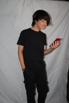
This is my worst picture from this section. It doesn't look interesting, it's unbalanced and you can see behind the background, you can also see that the angles are not right. I do not believe the subject is directly in the middle of the picture. I believe the white balance of this photo is unintentionally too low also making the image look to dark
|


I then zoomed in a bit and put the focus point more on the phone
Best
This is my best as it is well balanced, intriguing and well focused, I also put more focus on the phone to create a different effect. The ISO, around 200, and white balance, indoors, I used created a nice effect and a crisp picture. The lighting I used created a natural border around the subject creating a good effect. Shutter speed I used also made the picture look more crisp. In this image I like it because I believe it is well balanced and the message, being happy on social media, is well achieved and clear.
|
Worst
This is my worst from this section as it is not balanced, not well focused and has bad lighting, this has lead it to be uninteresting and for the subject to be lost. The grainy, out of focus look of this image was likely a result of me rushing when taking the picture are taking the picture while my model was moving. The lighting in the image isn't good as it looks as thought the light source is pointing from a bad angle or the model isn't standing in the correct space, this has caused there to be a shadow and the picture as a whole to be quite dark.
|


After this I moved on to taking sad moody pictures with a more dim light to create the mood.
Best
From this section this was my best photo as compared to the others. The lighting is the best and the background is perfectly placed so that the subject is in the center and is bright and clear, this allows for the emotion on his face to be more clear - this is the focus of the image. I also used a good ISO, probable around 200, to make sure the subject is clear and has good lighting. Also, the white balance I have chosen to use creates the good contrast in color's between the subject and background is good. Overall this image is the best because it looks how I intended and it delivers the message behind the image the best.
|
Worst
This is my worst picture as this picture is of balance, the lighting is bad, I have used a bad white balance and I have also used a bad ISO. I believe the angle I have used is largely at fault within this image as I didn't intend to capture his feet, as well as this in the corner of the image you can see behind the backdrop, creating a rushed, unprofessional look - this may have also caused the lighting of the camera to be off.
|


I then tried taking some photos of him sitting down with a black background making it look even more moody
Best
This was my best picture from this section as the ISO I used and the White Balance I used, joint together with the composition, positioning and lighting helped me create the good overall look of a more sad, meaningful picture. The black backdrop has achieved the affect I intended it to, overall a more moody, depressing vibe - delivering the message that social media isn't always a positive place, and you need to limit your use of social media. the ISO I have chosen to use would have been quite a high ISO looking at the lighting I was working with, as well as the white balance being rather bright to make sure the subject is clear despite the dark environment, overall this has created a good picture.,
|
Worst
From this section, this was my worst picture as it is out of focus, the subject isn't the focus point and the lighting isn't right. The white balance I used was also wrong causing the lighting to be bad. It also looks as though I rushed when taking the image, making the image blurry and the focus not in the center. Due to my of centered picture you can see behind the backdrop, this creates an unprofessional and rushed look. Overall this is why this was my worst picture from this section.
|
I started by taking pictures of Javi in quite a bright lighting


Best
This was my best picture from this section as the ISO is good - probably around 200 judging from the bright image - and the White Balance is good, quite a bright one, this allows for the viewer to clearly see the subjects facial expression, as well as the bright, clear lighting is good- all of this combined with the composition has lead to a eye-catching picture. I like this picture as the modal, as instructed, has an emotionless, lost facial expression. His bright blue eyes starring directly at the lens, is also a good affect as emotion is often held within the eyes and the bright blue eyes will catch the viewers eye straight away.
|
Worst
This was my worst picture from this section as the focus isn't central and the background isn't central either. This picture is also unprofessional and not esthetically pleasing as you can see past the backdrop, largely the reason why I have chose it as my worst.
|
I then did the same in a different lighting.


Best
This was my best picture from this section as the lighting, ISO and white balance is the best, as well as the composition is good which all come together to create a nice, intriguing picture. The lighting is not to bright neither to dim this creates a mellow, calm feeling, almost a feeling of being lost. I believe this lighting really matches the facial expression of the modal, looking lost and confused, showing the affect social media can have on someone's mental health. The ISO looks quite low, maybe around 100, matching the dark, lost mood and the white balance would have also been rather dark.
|
Worst
This was my worst picture from this section because the lighting is off and it is blurred. Another reason why I do not like this picture is due to the modal not being central and the image as a whole being off balance, with more of the background being visible on one side then the other. On top of all of this, I do not like this image because the yellow, orange lighting in the image was not the lighting I was going for, the lighting I was going for was more of a white, bright lighting.
|
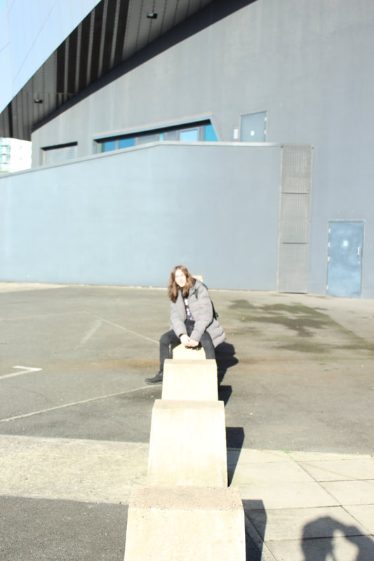
Manchester shoot-


Salford Quays Shoot:
Pictures of Joseph- Nature:


Best
This picture is my best picture from this section as it is well balanced, well focused, the subject is central and because of this it draws your eyes to the subject. The ISO has resulted in a clear and crisp image whilst the white balance has cause the colors to pop and the lighting to be perfect. The shutter speed was also high resulting in a clear and crisp image. I suspect the ISO was between 200-500 due to the outdoor, sunny environment, I suspect the shutter speed to be set to daytime. I really like the facial expression of the subject, the smoldering, emotionless glare into the distance. As well as all stated previously, I really like the affect that the sunlight shining on one side of my modal has.
|
Worst
This is my worst picture from this section as it is unbalanced, the subject isn't in the middle and it doesn't catch your eye, It is also slightly tilted and quite dim. The main reason why I have chosen this to be my worst picture is because it is really off balance, despite the subject of the image being central, the background is really off balance and un-even - overall this has lead me to decide this as my worst picture from this section.
|
Pictures of Joseph


Best
This was my best picture from this section as it is crystal clear due to the low ISO and fast shutter speed and is from a nice angle. The contrast between the orange jacket and the grey jacket as well as grey background has really made this image stand out from the others and has resulted in a nice finish. While the white balance has resulted in crystal clear colors. The angle I have taken this image from is nice because is capture all the curves and creases within the clothes crystal clear, creating a really cool affect over all. I also like how the modals facial expression looks, blank, staring into the distance.
|
Worst
This is my worst photo from the shoot as the model is mostly out of frame and it leaves and the lighting is to dark and gloomy, this might be a result of low shutter speed and bad lighting. This of centered finish was probably down to either rushing when taking the picture or the modal moving as I am trying to capture the image.
|
Pictures of Lukas sitting down


Best
This was my best picture from this section as the composition is intriguing and well balanced whilst the picture is also well focused and the subject matter is emphasized. As a result of a good ISO and white balance the image is clear and crisp whilst still having contrasting colors within. The high shutter speed and well chosen backdrop has resulted in a clear focal point and an emphasis on the emotion of the picture.
|
Worst
This was my worst picture from this section as it is unbalanced and the subject matter is lost and in motion, resulting in a blurred look.
|
Pictures of Lukas standing up


Best
This was my best picture from this section as I captured the models silhouette which stand sec out over the bright background, I must have used quite a low white balance and shutter speed because of how bright the picture is and I might have used a medium iso.
|
Worst
This is my worst picture as the model was expecting it to be taken and has his camera around his neck, the shutter speed is also too high as the picture is to bright.
|
link used to edit-
https://www.youtube.com/watch?v=1rujtPrYZHI
Str-
In this edit I was practicing the basics of photoshop, I used color alteration and edited the saturation of the photo. I like how I achieved the silhouette of the model.
Ebi-
Next time I will try a different style of edit and will use more features on photoshop, I will also use more snips when displaying it on my weebly, I will try include what I used in the edit in the slip.
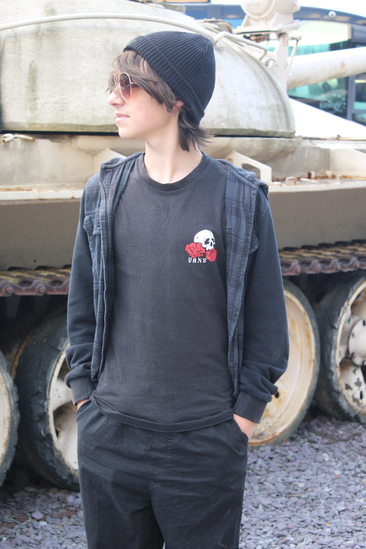
Pictures of Theo


Best
This was my best picture from this section of images for several reasons. One of these reasons is due to the camera angle I used, I like how the camera is pointed up towards the models face. I also like how crisp the picture has turned out this may be due to the ISO i have chosen to used, I assume rather low. I also think the shutter speed I used was high and fast leading to a crisp, detailed finish.
|
Worst
This is my worst picture as the ISO, shutter speed and white balance is of and the lighting is much to bright, causing the model to be out of focus. This is probably down to a low shutter speed, high ISO and high white balance. I also do not like the fact that I have captured my own shadow in this picture, this leads to a rushed, unprofessional finish on the picture.
|
Pictures of javi


Best
I think this is my best picture from this section as I like the ISO and white balance I used and the shutter speed I used has led to crystal clear finish, I also really like the models sun glasses and how the reflection on them. All of these features lead to a intriguing, eye catching image. I like how the models clothes are a different color to the background, this makes the model standout of the the backdrop.
|
Worst
This is my work at picture from this shoot as the shadow in it has caused for a bad finish.
|
Pictures of Albaraa


Best
I think this is my best picture from this shoot as the iso and white balance has lead to a crystal clear finish while the lighting and contents are great too. I also used a good white balance to achieve the finish I did. I also like the lighting of this shot.
|
Worst
I don’t like this picture as the lighting is off and I don’t like the stranger in the background.
|
Portrait pictures of Mariam


Best
I think this is the best photo from this shoot as the iso and white balance is good and I really like the contents of the photo. The shutter speed and way in which I took the picture has also made I strategic, purposeful blur which I like,
|
Worst
I don’t like this picture as I accidentally caught my fingers on camera when directing my model.
|
Power of YOU


Plan for Shoots
Name:
Finn
Project Title/ shoot number:
light/color
Description of aims for shoot:
Use different lights sources to create different effects and use different lighting effects and neon effects on photoshop.
Links with Photographers
I could use dan flavin’s work to inspire my work but then incorporate portraits and different effects on photoshop.
Location:
Props/ items needed:
Kit needed e.g. lighting, tripod, backdrop, macro lens:
I could find cool places in Stretford high to take pictures, I could also explore natural places in Manchester and take photos in my spare time.
A camera, a model, different lights such as LED lights, Photoshop, cool outfits, camera stand, green screen, plain backdrop, plants.
Tripod, backdrop, clear lens, camera, LED lights
Camera settings I will use:
F-Stop :
White Balance:
Shutter speed:
ISO:
f/5.6 - f/11
Kelvin 3200-4000 as iI aim to capture dark images
A high shutter speed
ISO 3200 or 6400
Which compositional rules will I use?
(Rule of Thirds, even numbers, odd numbers, symmetry, asymmetry, leading lines,
patterns, repetition, triangles, birds eye view, worms eye view, central focal point)
I could incorporate the rule of thirds then include a dissolving effect, I could also use symmetry and rule of thirds.
Edits-
Basic edit-
pre edit-

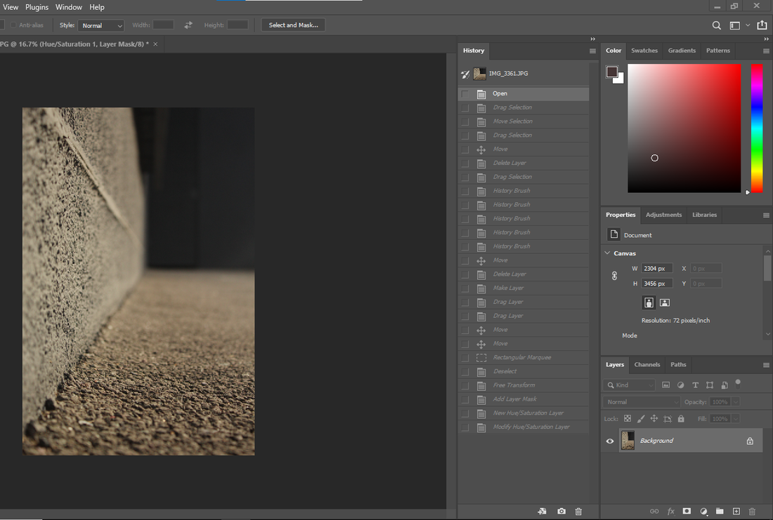
Hue/Saturation-

Color alteration-

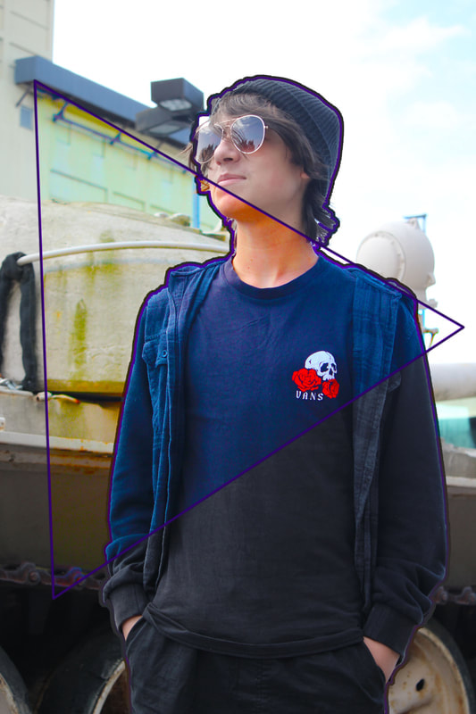
Pre-edit -

Add first blue line-
Complete full triangle-
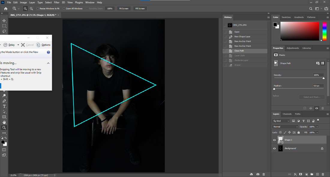
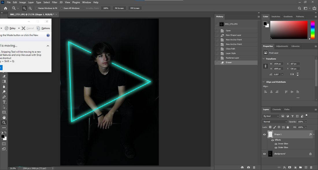
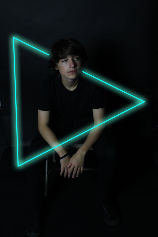
Add neon light-
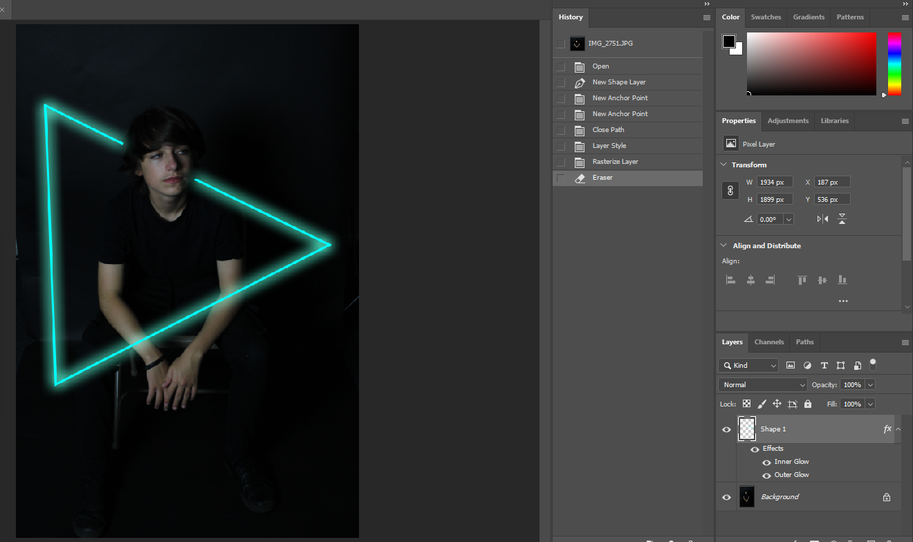
Erase over face-(finished)
Miniature subject edit-
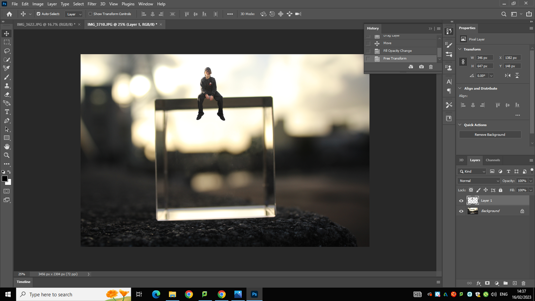
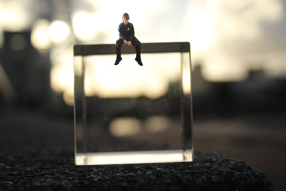
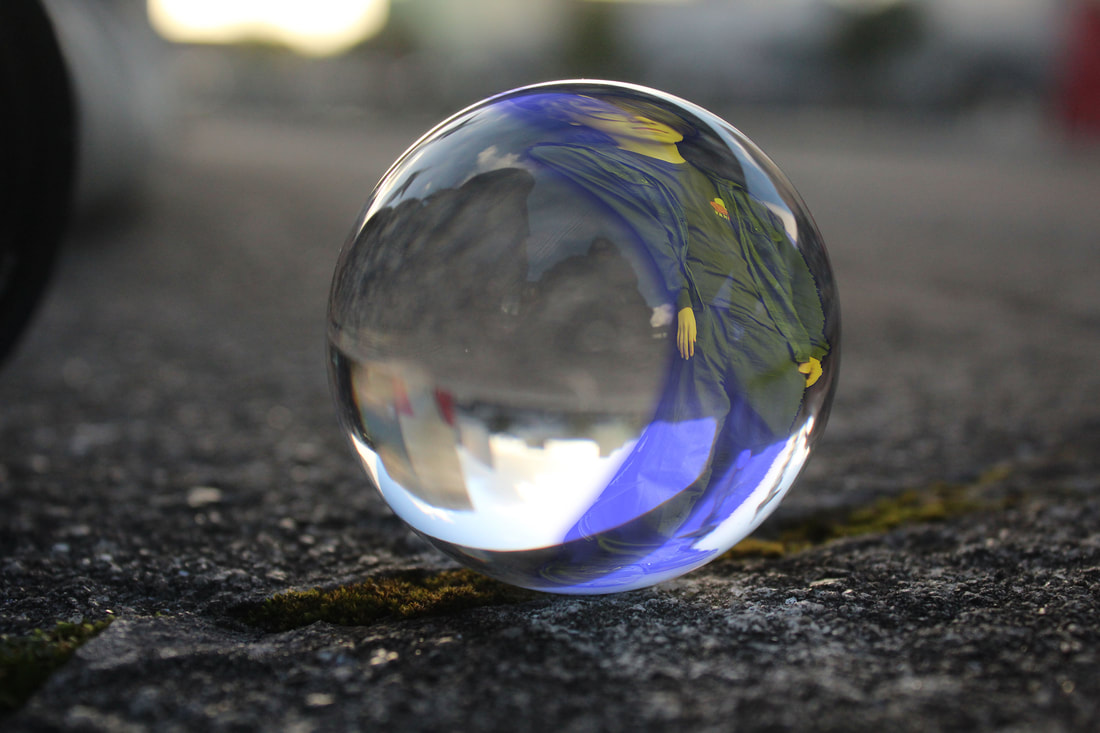
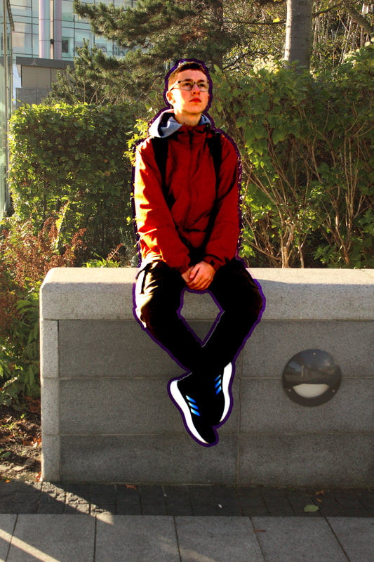
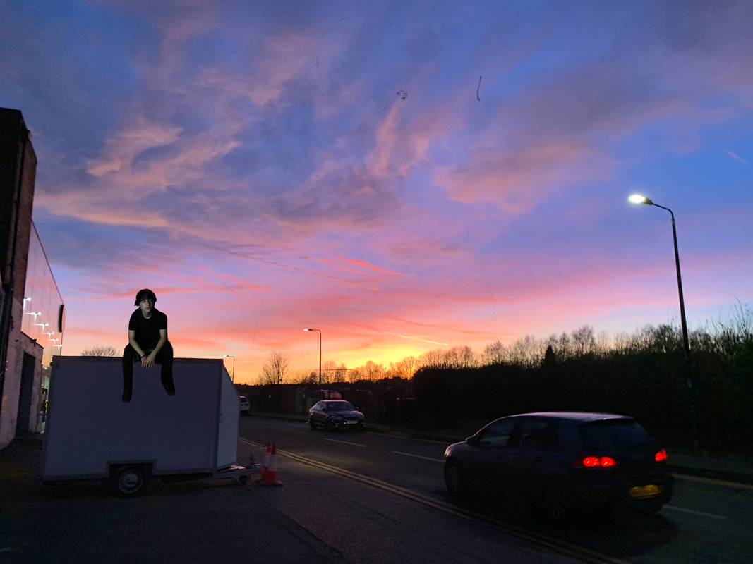
I chose to do this edit as I found it cool and interesting to see. It feels surreal and out of this world and I would like to in-cooperate it into my work as I think I could create some cool edits in this style and create interesting ideas with my own pictures. This edit also allows me to be more creative with my ideas and lets my imagination run wild with what backgrounds and objects I could include which I wouldn't otherwise be able to. Tatsuya Tanaka is a famous miniature subject photographer.
Miniature edits-
Step 1- Add background
Step 2-Add subject

Step 3-Copy subject onto background and flip

Step 4-Shrink subject
Step 5(finished)-

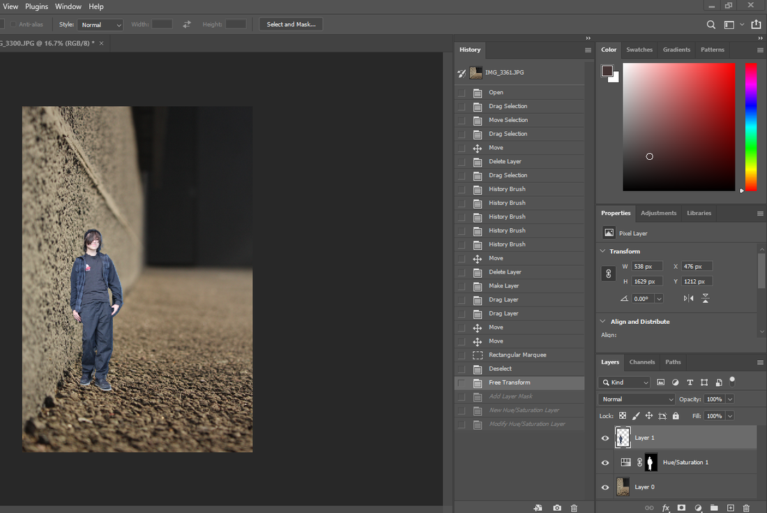
For this edit I used techniques such as used object selection tool to select my subject, move tool to move my subject and hue and saturation filter to alter the overall look of the image.
Javi edit#1


Finished edit-
Javi miniature subject edit-

Finished edit-
Javi miniature subject edit-

Javi stretch glass neon edit-
Neon edits
Javi cut out edit-

javi outline edit-

Joseph outline edit-

Javi two side phone edit-


Finished edit-

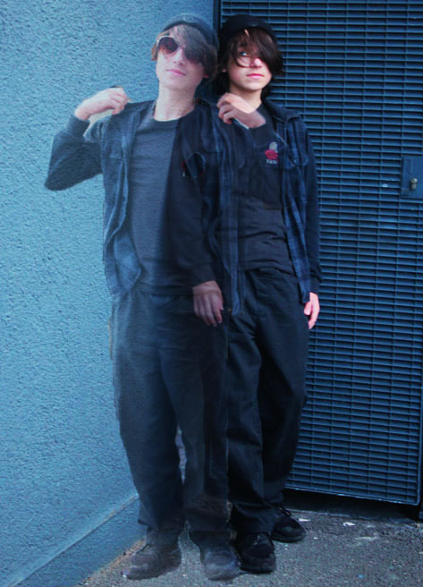
Javi double sided edit-


Before
|
After
|
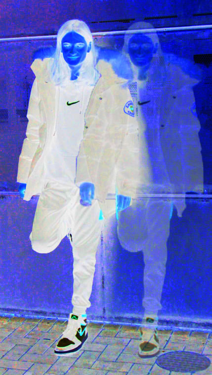
Double sided Lukas-


Before
|
After
|
Final Gallery
Neon edits-
|
|
Miniture edits-
Other edits-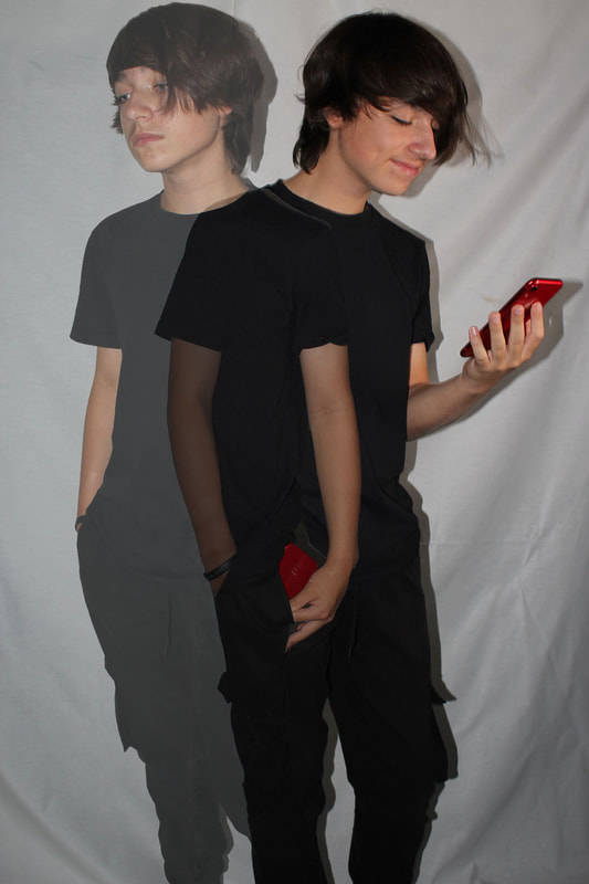
|

|
